[vc_row][vc_column][vc_column_text css=””]

The period of time from the early 1930s to 1950 was an era of deep uncertainty in America. The economic devastation of the Great Depression paired with the sacrifices made during World War II left the nation’s landscape looking bleak. The black and white photography of these years by artists such as Dorothea Lange reflected the emotional state of the country. But there were some bright spots amid the dark times, and one came from a surprising source: linen postcards.
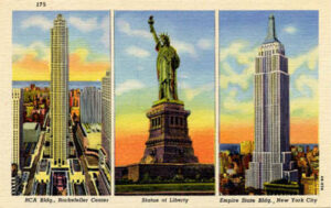
Inexpensive and accessible picture postcards, often sold for just one penny, gave viewers a glimpse into America’s colorful past and helped them see the brighter promise of tomorrow. As such, they became big business during an era of economic downturn. The largest manufacturer of postcards at that time was Curt Teich & Co. of Chicago, Illinois. Founded by German immigrant Teich (pronounced “Tike”) in 1898, the company pioneered the genre of “linen” postcards, with ultra-bright inks and an embossed finish to the paper that resembled linen fabric. Unlike earlier postcard printers such as Detroit Photographic Co. who used old-fashioned and expensive stone lithography to manufacture their wares, Teich employed offset printing presses that utilized stronger zinc plates and customizations that automatically fed the paper to the presses. This allowed Teich to print in high volume at relatively low cost.
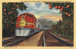
Once Teich & Co. had perfected their volume printing process, Curt Teich began looking for a way to improve the quality, color and detail of the company’s postcards. Through trial and error, Teich finally landed on the formula that would produce some of the most memorable postcards in printing history. By reducing the heaviness of the black ink and printing with new, brighter inks acquired from France, Teich began to achieve the bold look they desired. But the real breakthrough was the “linen” finish to the postcards’ paper. This look was achieved by embossing the paper with fine ridges, making it resemble linen fabric. But the linen-like finish was not decorative, it actually functioned to increase the surface area of the paper, allowing the bright inks to dry more rapidly, and thus retaining much more of their brightness. The new “linen” postcards were bold and saturated, with crisp details.
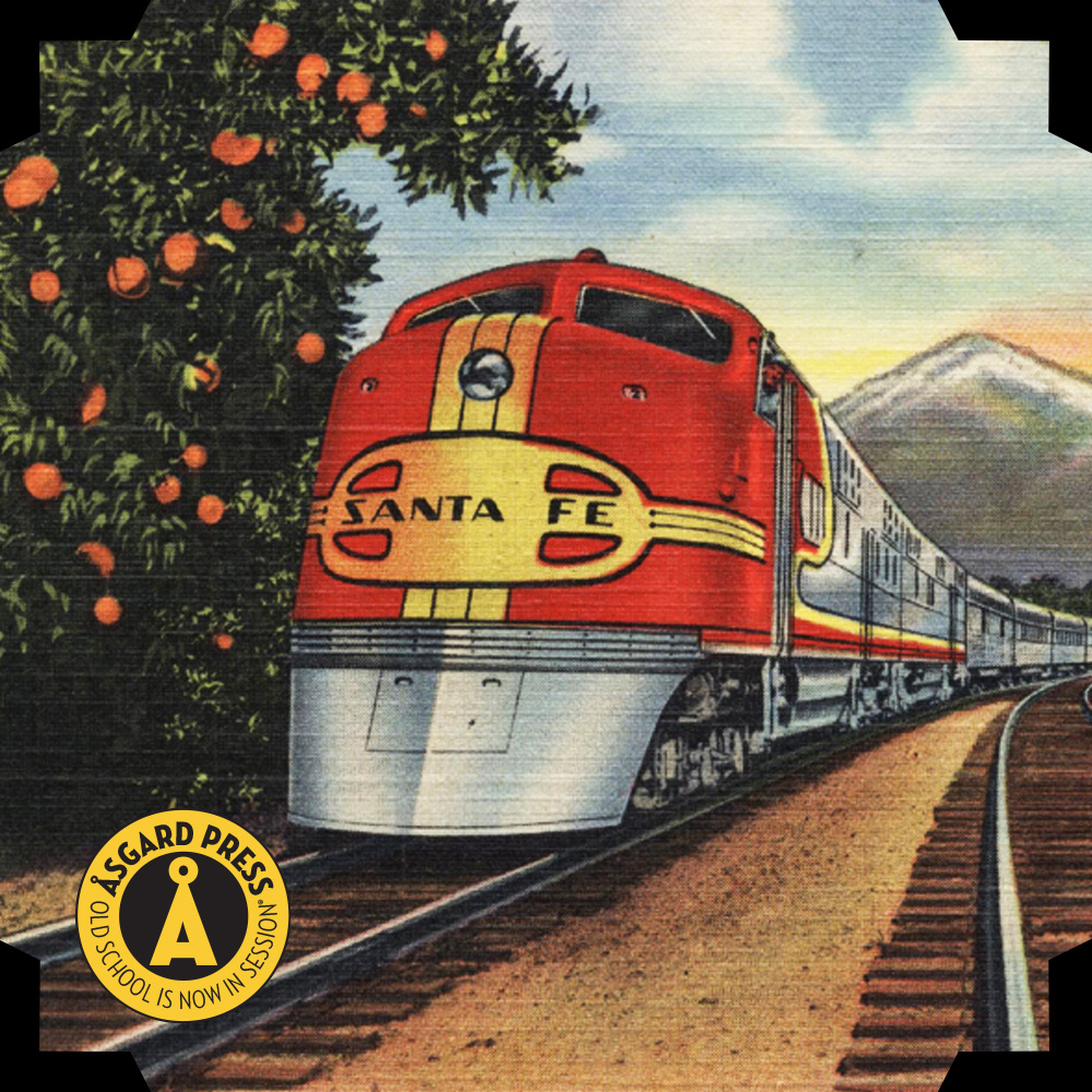
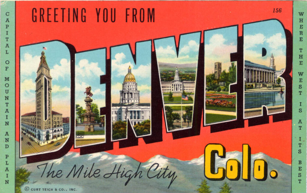
Teich linen postcards also stood out from the crowd compositionally. Skilled retouchers carefully cropped and edited the submitted photos, often incorporating notes left by the photographers. At times, multiple photographs were composited together to create idealized landscapes. The same photos could be duplicated as nighttime scenes with adjustments to the colors. Curt Teich & Co. were incredibly efficient, often able to generate multiple postcard scenes from just one or two photos. They may perhaps be best-known for their city and state name postcards, created by showcasing different postcard scenes in each letter, effectively reusing groups of photos for yet another postcard.
Photographers from all over the country were employed by Teich to take the photos that appeared in their postcards. Even the company’s regional sales representatives would take photos along their routes and submit them. One such rep was G.I. Pitchford, who was a sales agent for the west and southwest region. Pitchford may not have had a technical mastery of photography, but he had a knack for composition, and the retouchers made up the difference. Pitchford was a prolific photographer for Teich, and it is estimated that he provided images for nearly half of the postcards sold in his territory. Teich photographers didn’t stop at images of landmarks and famous places, they also captured scenes of everyday Main Streets, local businesses, restaurants, even service stations, all of whom were happy to be promoted at such low cost. From 1931 to 1950, Teich produced hundreds of millions of postcards.
The glory days for Curt Teich & Co., however, would not last forever. By the early 1950s, Kodachrome color film began to dominate the postcard industry, replacing the bold, bright Teich images with natural realism. Teich attempted to switch gears and managed to hang on but by 1978, the company was defunct, and the name and building passed out of use.
Today, Teich postcards are considered collectible. Their bold, saturated colors and dynamic compositions evoke nostalgia for the era in which they were printed, reminding us that a bright tomorrow is always on the horizon.
[/vc_column_text][/vc_column][/vc_row]
Pingback: The American Diner: Comfort Food and Culture - Asgard Press
Pingback: Travel to Paris, Told Through Photochrom Postcards - Asgard Press