2026 Vintage Musicals Deluxe Calendar 11″x15″

$29.99

16-month hanging calendar of frame-ready vintage musical movie poster art + commentary

Get ready to sing and dance with your favorite old musical films each month with this collection of faithfully reproduced vintage movie posters from the 1940s – 1970s.

Arriving Mid-September

16-month hanging calendar of frame-ready vintage musical movie poster art + commentary

Get ready to sing and dance with your favorite old musical films each month with the Asgard Press 2026 Vintage Musicals Deluxe Wall Calendar, a collection of faithfully reproduced vintage movie posters from the 1940s – 1970s. These classic posters showcase the musical cinematic entertainment of an earlier era, complete with all the glitz and glamour of the big stars on the big screen. Musical movies of this era transported audiences to a world of song, dance, and enchantment. From the lavish productions of MGM to the energetic choreography of performers like Judy Garland, Fred Astaire, and Elvis Presley, these films captured the essence of joy and escapism. With memorable tunes, dazzling costumes, and elaborate sets, musicals like “Camelot,” “Blue Hawaii,” and “Funny Face” became timeless classics, leaving an indelible mark on the history of cinema. These movies not only showcased the talents of their performers but also served as a reflection of the cultural aspirations and dreams of their era, providing a respite from the realities of the time. Each month you can enjoy the poster art of one of these iconic films, accompanied by in-depth commentary telling the story behind each musical. With its large vertical format of 11×15 inches, our wire-bound deluxe wall calendar opens to an impressive 11×30 inches. The perforated design allows for easy removal of each month’s image, making them a perfect fit for standard 11×14 inch frames. Generously sized grid spaces leave plenty of room to keep track of all your appointments, reminders, and events. Bring the optimism of old Hollywood to your walls each month and organize your days with song and dance.

  • 2026 16-month wall calendar – September 2025-December 2026 – Use this calendar right away with mini-grid page of the last 4 months of 2025
  • Features full color vintage posters of classic musical movies accompanied by extended commentary each month detailing the story behind each poster’s film
  • Large format opens to 11″x30″ with spacious grid pages for at-a-glance organization of appointments and events, and includes major US holidays and moon phases
  • Includes 13 easy-to-remove prints that fit standard 11″x14″ frames for sustainable reuse
  • Decorate affordably with trendy vintage artwork and photos
  • Plenty of room to write in the grid spaces
  • Heavy, archival paper vibrantly showcases each month’s image and prevents bleed-through of pen or marker ink on grid pages
  • Perfect for hanging in home, office or classroom

The more calendars you buy, the more you save with our volume discounts!
BUY THIS MANY GET THIS DISCOUNT
1
2 10% off
3 15% off
4 20% off
5 25% off
6 25% off

When you order 6 calendars, you also receive a FREE CALENDAR of your choice! Just add a 7th calendar of your choice to the cart and the value will be deducted automatically.

Weight .75 lbs
Dimensions 11 × 15 × .25 in

Reviews

There are no reviews yet.

Only logged in customers who have purchased this product may leave a review.

Shopping Cart

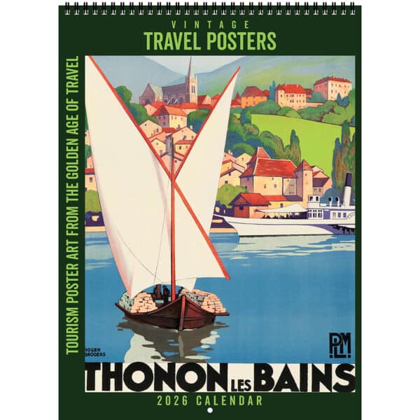
Sample image from the Asgard Press 2026 Vintage Travel Posters Calendar

Thonon-les-Bains, nestled along Lake Geneva’s southern shore, is celebrated for its rich history and cultural heritage, offering visitors a blend of natural beauty and historical landmarks. Notable sites include the medieval Château de Ripaille, the Chablais Museum housed in the 17th-century Château de Sonnaz, and the Basilica of Saint François de Sales, renowned for Maurice Denis’s frescoes.

This will close in 0 seconds

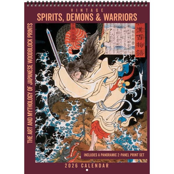
Sample image from the Asgard Press 2026 Vintage Spirits, Demons & Warriors Calendar

Gongsun Sheng, the Dragon
in the Clouds
Tsukioka Yoshitoshi, 1865
Gongsun Sheng is one of the main characters in the Chinese novel Shuihu Zhuan (Water Margin), which in Japan is titled Suikoden and was a historically popular literary work. Gongsun Sheng is a Taoist mystic, warrior, and one of the 108 Stars of Destiny, who fights alongside the rebels and outlaws who are the heroes of the novel. Gongsun Sheng’s nickname was Dragon in the Clouds due to his ability to summon storms, control wind and rain, and disappear into the mist using Taoist magic. He is deeply connected to the Way of the Dao, with knowledge of spells, alchemy, and martial arts and is a trusted military advisor who uses his intelligence and supernatural abilities to turn the tides of battles. Though he possesses magical skills, Gongsun Sheng is also a master of swordsmanship and staff combat.
Though Gongsun Sheng is associated with the dragon due to its connection to the water and clouds, his spiritual enlightenment transcends the earthly power that dragons often symbolize. His pursuit of immortality leads him away from the path of mortal corruption and into the mountains where he enters into deep Taoist study and thereby avoids the tragic fate of the other heroes of the novel. His character symbolizes the choice of the spiritual over the earthly, a connection to nature, wisdom, and detachment from mortal concerns such as greed or revenge.
Yoshitoshi’s treatment of Gongsun Sheng in this print shows the character as a face of calmness and detachment amidst a swirling of action all around him. The bold contrast of Sheng’s colorful figure against dark, turbulent skies emphasizes his connection to the dragon and his ability to control the weather. Yoshitoshi’s Suikoden prints were part of his larger exploration of legendary figures and their struggles, bridging the gap between historical storytelling and artistic innovation.

This will close in 0 seconds

Sample image from the Asgard Press 2026 Vintage Sci-Fi Calendar

Amazing Stories; Cover Art: Leo Morey; Teck Publications, December 1934.

After Hugo Gernsback was forced out of Experimenter Publications and its successful magazine Amazing Stories in 1929, editor T. O’Conor Sloane remained behind to run the pulp for the new publisher. When Gernsback launched his new publishing company and magazines, he took with him artist Frank R. Paul, an innovator in science fiction illustration and a key to the popularity of Amazing Stories. Sloane cast about for a replacement artist and found Leo Morey, a native of Peru who began working as an illustrator in the United States after attending Louisiana State University for engineering. Morey had been a newspaper staff artist in New Orleans before moving to New York City in 1931 following the tragic loss of his first wife. He then began illustrating for pulps, providing both covers and interior illustrations and building a reputation for science fiction art. As Morey was too old for military service during World War II, he was one of a small handful of pre-war artists who remained active in pulp illustration during the war. Historically, science fiction critics have been somewhat divided in their assessment of Morey’s work, with some seeing his rendering of technology and architecture, staples of science fiction art, as unimpressive. Most agree, however, that when Morey connected with his subject matter, he produced colorful and imaginative work, particularly of human and alien figures, that is often held forth as exemplary of the genre. While Frank Paul is remembered as a pioneer of science fiction illustration, Morey distinguished himself as a worthy successor, helping to make Amazing Stories one of the most historically important magazines in pulp history.

This will close in 0 seconds

Sample image from the Asgard Press 2026 Vintage National Parks Calendar

WPA posters often embraced flat design aesthetics, characterized by bold colors, simplified shapes, and clear messaging. This style was also dictated in part by the method of reproduction the WPA employed most often, serigraphy. This printing process used a series of stencils screen-printed onto paper and was most successful with bold, flat designs. By employing flat design, the WPA posters achieved both artistic appeal and practical production, becoming iconic symbols of American art and history.

This will close in 0 seconds

Sample image from the Asgard Press 2026 Vintage Pulp Westerns Calendar

Masked Rider Western; Cover Art: George Rozen; Better Publications, April 1949.

Masked Rider Western was originally published by Martin Goodman’s Ranger Publications before being sold to Ned Pines and Better Publications in 1937, who ran it as part of their Thrilling Publications imprint. Goodman would go on to found Timely Comics in 1939, a business venture that would eventually rocket to fame as entertainment giant Marvel Comics. Masked Rider Western was a hero pulp, following the exploits of Wayne Morgan, an honest cowboy with a keen sense of right and wrong. As the Masked Rider, Morgan and his sidekick Blue Hawk travel the West, standing up for the innocent and bringing outlaws to justice when the law can’t or won’t. Each issue of Masked Rider Western ran a novel about Wayne Morgan’s adventures, along with an assortment of other stories about the Western frontier. The magazine was one of the longest-running Western pulps, with over 100 issues appearing on newsstands until the last issue in 1953. Authors who contributed to Masked Rider Western include Les Savage, Jr. who was known for stories with grit, realism, and strong character development, and Walker A. Tompkins, who’s writing often included accurate historical detail and a strong sense of place. The cover art for the April 1949 issue was created by pulp artist George Rozen who mastered hero pulp illustration through his work on The Shadow, the era’s top-selling pulp, beginning in 1931. George and his twin brother Jerome were both professional artists, with Jerome concentrating on advertising art and George creating covers for pulp magazines such as Western Aces, Thrilling Adventures, and Captain Future.

This will close in 0 seconds

Sample image from the Asgard Press 2026 Vintage Pulp Horror Calendar

Strange Stories; Cover Art: Earle Bergey; Better Publications, October 1939.

In 1939, Standard Publications launched horror pulp Strange Stories to compete with industry leaders Weird Tales and Street & Smith’s Unknown. Strange Stories fell under the editorship of Mort Weisinger, who was also editor for the science fiction pulps Thrilling Wonder Stories and Startling Stories. Weisinger procured stories from many of the same authors that had published work in the bigger magazines. However, Strange Stories had such a low budget for authors that its stories, with few exceptions, were not considered high quality despite having been written by talented writers, including August Derleth, Henry Kuttner, and Robert Bloch. Strange Stories lasted for 13 issues, ending publication in 1941 due to poor advertisement and the departure of Weisinger to edit Superman and Batman for National Publications/DC Comics. The covers for Strange Stories were painted mostly by Standard in-house artists Rudolph Belarski and Earle Bergey, including the art for the October 1939 issue by Bergey. Earle Bergey was a magazine and pin-up artist who was trained in fine arts, with a keen eye for anatomy. His penchant for depicting women in metallic lingerie for his pulp covers gave rise to the phrase, “the girl in the brass bra,” the most famous of which may be Princess Leia in Star Wars: Episode VI – Return of the Jedi (1983), which is said to be inspired by Bergey’s work. Bergey began his career in Philadelphia as a newspaper staff artist but switched to pulp art to find work during the Great Derpession. His early cover work was primarily pin-up for “girlie” magazines, and he also provided art for the covers of sports, horror, and science fiction pulps for Standard’s Thrilling Publications.

This will close in 0 seconds

Sample image from the Asgard Press 2026 Vintage Pinball Calendar

Slap Stick
1976

Slap Stick is all about flipping over the four flags at the top of the playfield, and building up the bonus. This game plays on the easy side, so although I usually like to set these vintage machines at five balls per play, in this particular case I set this machine at three balls. It is fairly easy to earn an extra ball so the player will most likely get more than three balls anyway. Owning a machine where there were only 85 ever produced is a cool thing. One has to wonder about the story behind why they only made 85 Slap Sticks. It can be speculated that one of two things happened: the machine either did not test well, or a much hotter-selling or important machine came along and they needed the manufacturing space, so Slap Stick was bumped from production. It was probably both of these things.

Back in the day, prior to full production, a few select machines were put out on location. Feedback was taken from these locations to see how the general public liked these machines and how likely they were to drop quarters into them, which is ultimately why pinball was produced at all. Production estimates were then calculated based on this feedback.

Sometimes ugly artwork doomed a pinball machine. But Slap Stick is a beauty. The use of green, yellow and red is striking. I love the color scheme. It seems odd today to have a policeman so prominently displayed on a backglass that depicts a circus. Yet nearly 100 years ago as circuses were seemingly everywhere (and unregulated), reputable circuses had their own police force. Fascinating stuff!

The gameplay on this machine is pretty easy. Maybe that’s why they pulled it off the line with less than 100 units produced. And maybe it was too expensive to produce. It has a space hogging and pricey flip flag mechanism in it that was only used on two other machines.

I don’t think we will ever know in this particular case. Whatever the reasoning, as a collector I’m happy there are so few.

This will close in 0 seconds

Sample image from the Asgard Press 2026 Vintage Musicals Calendar

Top Hat; 1935; Studio: RKO Radio Pictures; Director: Mark Sandrich; Cast: Fred Astaire, Ginger Rogers. Top Hat (1935) was the third of nine films dancing duo Fred Astaire and Ginger Rogers made together and was their most commercially successful partnership. Set in London, England and Venice, Italy, the film was actually produced entirely on sound stages at the studios of RKO Radio Pictures. In keeping with the art deco designs and Hollywood tastes of the 1930s, the sets for Top Hat are stylized versions of the settings they represent, giving the crew complete control when filming the elaborate choreography. The all-original score for the film was written by Irving Berlin, a novel approach in an era when most movie musicals were adapted from successful Broadway shows with established songs and story lines. Berlin was able to tailor his songs to the styles of Astaire and Rogers, and to weave the musical numbers into the plot of the film, making them part of the narrative, especially in the development of the romance between the characters. This approach to scoring paired perfectly with the way Astaire and Rogers used dance for storytelling and to convey romance, a hallmark of their partnership that helped define the Hollywood musical for decades. Astaire insisted that dance scenes be filmed full-body and with minimal cuts so audiences could appreciate all the nuances of the choreography and allow the dance to give insight into the characters. Top Hat was a lucrative box office smash, setting a house record at Radio City Music Hall in its first week on screen. The film would go on to be RKO’s highest grossing picture of the 1930s, carrying the studio through the Great Depression and proving that an original musical film could be just a viable as a Broadway adaptation. Top Hat continues to inspire Hollywood directors, choreographers, and fashion designers and is frequently cited as one of the greatest musical films of all time.

This will close in 0 seconds

Sample image from the Asgard Press 2026 Vintage Movie Posters Calendar

East of Eden; 1955; Studio: Warner Brothers; Director: Elia Kazan; Cast: James Dean, Julie Harris, Raymond Massey. Although actor James Dean is remembered by most for his performance in Rebel Without a Cause (1955), his first starring role was in East of Eden (1955), the only one of his three films to be released within the actor’s short lifetime. The embodiment of an emerging youth culture that was gaining its own social and economic power, Dean had enormous influence on teenagers of the 1950s who adopted his clothing, hairstyle, and rebellious, moody attitude. Dean’s on-screen performances mesmerized audiences and critics through a combination of Method Acting and infusing his own personality into his roles, giving his characters authenticity and emotional depth, and his death in a car accident at the age of 24 catapulted him to icon status in Hollywood. The film East of Eden is based on the John Steinbeck book of the same name, although the storyline uses only the last 80 pages of the novel to tell the story of a young man in competition with his brother for their father’s love. Often thought of as a modern interpretation of the Biblical story of Cain and Abel, East of Eden showcases Dean’s talent for playing the misunderstood outcast, drawing parallels between his portrayal of Cal Trask and his role of Jim Stark in Rebel Without a Cause. In both films, Dean plays a rebellious teenager yearning for belonging, ultimately reconciling with a distant father. East of Eden is also remembered for its beautiful cinematography, capturing the lush farming valleys of Northern California and using the color and richness of the setting to set the tone and atmosphere for the film. Nominated for four Academy Awards and winning for Best Supporting Actress for Jo Van Fleet, East of Eden still connects with audiences today through its arc of pain and redemption and for its immortalization of James Dean as the eternal outcast.

This will close in 0 seconds

Sample image from the Asgard Press 2026 Vintage Monsters Calendar

Horror of Dracula; 1958; Studio: Hammer Film Productions; Director: Terence Fisher; Cast: Peter Cushing, Michael Gough, Melissa Stribling, Christopher Lee. In the 1950s, British studio Hammer Films revolutionized horror filmmaking with a new generation of Gothic tales steeped in blood, sex, and aristocratic style, beginning with their interpretation of Mary Shelley’s classic novel Frankenstein. The Curse of Frankenstein (1957) ushered in a new era of horror, filmed in color in a stylized, saturated palette that emphasized the gore that audiences found increasingly appealing for its shock value and the way it pushed boundaries. Universal’s classic horror films from the 1930s seemed tame and old-fashioned by comparison, and Hammer was eager to take back the British literary legacy of stories like Frankenstein and Dracula with their own, modern interpretations. Following the success of The Curse of Frankenstein, Hammer launched their own retelling of Dracula (released as Horror of Dracula in the Unites States to avoid confusion with Universal’s Dracula of 1931), with Christopher Lee in the titular role. Lee brought his own ideas to the part, preferring to draw more closely on Bram Stoker’s original novel than earlier interpretations had. Lee’s Dracula introduced the red eyes and dripping fangs that audiences associate with the character today, but also brought elements of tragedy, romance, and sensuality to the role, hinting at the romantic attraction that total surrender to a charismatic man might hold for a woman. Hammer’s Dracula was a blockbuster at theaters, solidifying Hammer’s place in the horror film genre and turning Christopher Lee and co-star Peter Cushing into horror icons almost overnight. Hammer’s modern approach to horror–violent, sensual, tragic, and complex–influenced generations of filmmakers, leading to taboo-breaking slasher and psychological horror in the 1960s and 1970s. Hammer Films brought horror back from the dead to entertain and shock audiences with a new, fresh, gory take on old stories.

This will close in 0 seconds

Sample image from the Asgard Press 2026 Vintage Magic Calendar

SLEIGHT OF HAND TRICKS

The Card Banner

The performer hands for examination a piece of black silk, corded or otherwise, so long as the one side is not distinguishable from the other, about eighteen inches square; this he lays on the table, as shown in Fig. 11. In doing this, he takes care that the rear half comes immediately over three cards, which, by means of a little soap previously rubbed on their backs, and slight pressure, are caused to adhere to the silk. The cards are not observed prior to being covered, owing to the fact that their backs are of a similar pattern to the cloth on the table.

Three cards, facsimiles of those on the table, are now forced on unsuspecting members of the audience; and, this done, a fourth spectator is commissioned to collect the three cards, and to thoroughly shuffle them with the rest of the pack. This obliging individual is next induced to step upon the stage, and at the word “three” to throw the whole of the cards at the banner, which the performer holds up for that purpose, as shown in Fig. 12.

The performer announces that at the word “three” he will let fall two corners of the banner, when, if the gentleman will act in accordance with his instructions, the three chosen cards will appear thereon.

This is affected after the following manner:

The performer takes the two front corners of the silk (“a” in Fig. 11) between the first and second fingers, and folding it in half, grips the two opposite corners between the first finger and the thumb of either hand, bringing it into position (see Fig. 12) with the three cards on the side most remote from the audience.

When announcing that he intends to let the banner fall open, the operator, by way of illustration, releases the two front corners, which, falling, give the impression that the silk has undergone no preparation. Again, taking the silk into position, he exclaims, “Now, sir! are you ready? Thank you— then one, two, three,” whereupon the gentleman throws the cards, and as they come in contact with the banner the performer releases the two back corners, thereby bringing the three duplicate cards into view.

The three select cards are on the floor with the others, but this is not at all likely to be noticed.

This will close in 0 seconds

Sample image from the Asgard Press 2026 Vintage Horror Comics Calendar

Chamber of Chills #19; Cover Art: Lee Elias; Harvey Comics, September 1953.

Chamber of Chills was another of publisher Harvey’s horror comics, running for 26 issues from 1951 until 1954, meeting its demise with the advent of the Comics Code along with many other horror comics. Chamber of Chills #19 is one of the most well-known horror comics in pop culture history, with collectors expecting to shell out over $40,000 to acquire a near-mint condition copy. The fame of this issue and its cover has only grown over time as other artists have used it in homage, including the horror-punk band the Misfits who famously modified the artwork for the 1984 cover of their single, “Die, Die My Darling.” The iconic simplicity of the cover’s artwork has made it representative of the horror comic genre, summing up the content and aesthetic for readers. The original artwork for the cover of issue #19, created by Lee Elias, sold at auction in 2020 for $174,000. Elias began his comic career in 1943 at Fiction House, before settling in at Harvey to work on Black Cat, a superhero comic featuring a stunt woman turned crime fighter, as well as contributing artwork to some of Harvey’s horror comics. His artwork for comics such as Tomb of Terror and Black Cat Mystery are some of the most dynamic and grotesque covers of Golden Age horror, filled with expressive characters and the appearance of motion. Dripping slime and exploding flesh were rendered with both cinematic drama and technical expertise in the hands of Lee Elias. After Seduction of the Innocent referenced several of his Black Cat panels in their takedown of comic books, Elias shifted to comic strip work. He later returned to comic book illustration, working for both DC Comics and Marvel Comics in the 1970s.

This will close in 0 seconds

Sample image from the Asgard Press 2026 Vintage Superheroes Calendar

Master Comics #19; Cover Art: Mac Raboy; Fawcett Publications, October 1941.

The anthology comic Master Comics was just one of the homes of Bulletman, a ballistics expert who invents formulas and gadgets that give him super strength, higher brain power, and the abilities to fly and deflect bullets. Bulletman first appeared in the debut issue of Nickel Comics in May 1940 and featured in America’s Greatest Comics while simultaneously starring in his own namesake comic book. Bulletman’s popularity hinged on his distinctive, unique look including his bullet shaped helmet, a strong “science hero” angle, and the early and successful addition of a partner, Bulletgirl. Unlike the female characters commonly seen in comics of this era, Bulletgirl fought crime alongside Bulletman as an equal, with the same powers and strengths, widening their audience to include both boys and girls, and maybe even their parents, too. Eventually, a kid sidekick, Bulletboy, and a canine crusader, Bulletdog, were added to the lineup. Bulletman was created by writer Bill Parker and artist Jon Smalle as a feature for Nickel Comics, and many of Bulletman’s adventures were contributed by Jack Binder’s comic packaging studio, who also handled Fawcett’s Mary Marvel series. The cover art for Master Comics #19 was contributed by Mac Raboy, the artist who also defined the look of Fawcett’s popular Captain Marvel, Jr. series. Raboy brought the sensibility of a classical painter to his comic art, balancing compositions with strong diagonals and flowing circular elements. His characters had refined, romanticized faces, youthful beauty, and heroic expressions. Raboy was well known for his detailed line work that was fine, intricate, and controlled, producing work that looked engraved rather than inked.

This will close in 0 seconds

Sample image from the Asgard Press 2026 Vintage Film Noir Calendar

This Gun for Hire; 1942; Studio: Paramount Pictures; Director: Frank Tuttle; Cast: Veronica Lake, Robert Preston, Laird Cregar, Alan Ladd.

Considered essential viewing for any fan of film noir, This Gun for Hire (1942) helped define the style, tone, and themes that would become central to the genre. The film is based on a novel by Graham Greene and taps into postwar existentialism and hard-boiled fiction. This Gun for Hire explores gray morality in which a character is neither good nor bad, or is perhaps both, a noir hallmark. The hitman played by Alan Ladd, in his breakout role, is both villain and hero, presenting the “antihero” archetype that would appear in numerous subsequent films noir. The antihero’s moral ambiguity is explained by his experiences, highlighting how a corrupt system exploits, and then discards, ordinary people. Visually, the film is moody and stylish, utilizing high-contrast lighting, urban grit, and rain-soaked streets to heighten psychological tension. Cinematographer John Seitz used deep shadows and dramatic framing to heighten moral ambiguity, techniques which he would later carry into the classic film noir Double Indemnity (1944). Though This Gun for Hire lacks a traditional femme fatale, Veronica Lake takes on a strong female lead, alluring and mysterious, while also intelligent and resourceful. Like many World War II-era films, This Gun for Hire was scripted to include anti-fascist messaging and patriotic motivation, making the ultimate villain a collaborator with the enemy, and thus the antihero’s revenge becomes an act of wartime patriotism, allowing his redemption. During filming, it became apparent to Paramount Pictures and director Frank Tuttle that Alan Ladd would become a big star. After the initial box office success of This Gun for Hire, the film was rereleased in 1945 with advertising posters altered to give Ladd top billing, and Ladd and Lake would go on to make six more movies together.

This will close in 0 seconds

Sample image from the Asgard Press 2026 Vintage Baseball Cards Calendar

David Shean

b: July 9, 1883
d: May 22, 1963

David William Shean was a well-traveled middle infielder who spent 14 seasons in professional baseball, of which nine were in the major leagues (1906-1919). Shean batted and threw right-handed. After making his major league debut on September 10, 1906 with the Philadelphia Athletics, the Arlington, Massachusetts native played for the Philadelphia Phillies, Boston Doves (later to be known as the Braves), Chicago Cubs, Cincinnati Reds, and Boston Red Sox. Following the 1912 season, he spent four productive seasons with the Providence Grays of the Eastern League, rising to player/manager, and where he became a teammate of Babe Ruth. He returned to the majors for the 1917 season with the Reds. Over his career, the 5’11”, 175-pound second baseman/shortstop hit for a .228 average, with six home runs, 167 RBIs, 225 runs, 59 doubles, 25 triples, and 66 stolen bases. Unusual for the era, Shean was college educated, having attended Boston’s Fordham University. His longest tenure in any one team was three seasons with the Doves of the National League. Shean’s best season came in 1918 as a member of the pennant-winning Boston Red Sox. That year he posted career-highs in batting average (.264) and runs (58). He also led the American League in sacrifice hits (36). The Red Sox went on to win the 1918 World Series, beating the Cubs four games to two. Appearing in all six games of the Fall Classic, he hit .211 (4-19). Following his baseball career, Shean entered the business world and rose to be president of Nathan Robbins, a poultry firm. Shean died on May 22, 1963 in Boston, aged 79, after injuries he sustained in an automobile accident. He was survived by a son, David William Shean, Jr.

This will close in 0 seconds

Sample image from the Asgard Press 2026 Retro Zodiac Pinups Calendar

April 2026 Horoscopes

Aries

April’s finances improve, a welcome boost! Singles, your social life ignites! Expect vibrant gatherings and exciting new connections. Embrace the positive energy, and enjoy the financial relief.

Taurus

Pause, then act. Impulsive moves lead to trouble. Diplomacy at work is vital. Think carefully, and choose words wisely. Smooth interactions bring success.

Gemini

Career growth stalls, patience needed. Finances improve, a welcome boost! Navigate work hurdles, enjoy monetary gains. Steady financial progress, despite workplace delays.

Cancer

Work demands flexibility; adapt quickly. Relationships need harmony; seek peace. Embrace change at work, and cultivate calm in love. Fluidity and understanding lead to success.

Leo

Vigor fuels life progress; seize the day! Love conflicts may arise, handle with care. Embrace energy for success, and navigate romance with diplomacy. Action and understanding are key.

Virgo

Big life changes are on the horizon. Love needs compromise; find middle ground. Embrace transformation, and seek balance in relationships. Adapt and harmonize.

Libra

Career assistance arrives; accept support. Singles find love through sports; join the game. Embrace help at work, and let activity spark romance. Teamwork and passion bring rewards.

Scorpio

Career and married life demand focus. Finances show progress; enjoy gains. Dedicate energy to work and partnership. Prosperity and stability align. Prioritize and prosper.

Sagittarius

Love blossoms, enjoy the connection. Financial progress accelerates; reap rewards. Savor romantic moments, and celebrate monetary gains. Passion and prosperity align. Find joy in both.

Capricorn

Intelligence needed for family issues; think strategically. Marriage affected by stress; communicate openly. Approach family tensions with wisdom, and address relationship strain directly. Clarity and connection.
Aquarius

Family and social ties strengthen; connect deeply. Singles find love; open your heart. Nurture relationships, and embrace romantic possibilities. Connection and openness bring fulfillment.

Pisces

Finances demand focus; strategize for growth. Happiness blossoms in marriage; cherish the bond. Plan for prosperity, and nurture loving connections. Financial and marital bliss align.

This will close in 0 seconds

Sample image from the Asgard Press 2026 Vintage Motorcycles Calendar

Charles Farrar on his Harley-Davidson

Washington, DC, 1949

During World War II, Harley Davidson Motor Company shifted its manufacturing almost entirely to military production. From 1941 to 1945, Harley Davidson built 90,000 units of its military model WLA, nicknamed the “Liberator,” for the US Army, featuring a 750cc Flathead V-Twin, blackout lights, and a scabbard for a rifle.  After the war, surplus WLAs became popular among returning soldiers and motorcycle enthusiasts who enjoyed customizing them, creating the beginning of “chopper” culture. In 1946, Harley Davidson resumed civilian motorcycle production of many of their pre-war models, but a revolution in motorcycle design was on the horizon. In 1948 they introduced their Panhead engine, featuring aluminum cylinder heads, better oil circulation, and hydraulic valve lifters, making it cooler, quieter, and more reliable. A year later, they replaced the old springer front end with hydraulic telescopic front forks, a major upgrade that improved stability and performance, ushering in a new era of major touring bikes. This portrait of Charles Farrar shows him astride his 1949 FL Hydra-Glide, the first Harley Davidson model to feature the new suspension. Farrar’s hat and patch hint at time in the military or police force, aligning with his interest in a bike that may have greatly resembled the one he rode in service. The FL Hydra-Glide boasted a 1200cc V-Twin Panhead engine with a power output of approximately 50 horsepower, delivering a top speed of roughly 100 miles per hour. The bike retained the classic Harley Davidson styling, with large full fenders, iconic teardrop gas tank, and traditional foot clutch/hand shift, and sported wide balloon-style tires that helped absorb road shocks and provided better stability. Today, the 1949 FL Hydra-Glide is rare and therefore highly collectible, as it is representative of a pivotal point in Harley Davidson design history.

This will close in 0 seconds

Sample image from the Asgard Press 2026 Vintage Art of Space Calendar

The STS-3 Mission, launched on March 22, 1982, was the third flight of the Space Shuttle Columbia and served as a critical test of the shuttle’s thermal and flight systems. Astronauts Jack Lousma and Gordon Fullerton conducted various experiments, tested the Canadarm robotic arm, and evaluated how the shuttle handled extended time in space. After eight days in orbit, Columbia landed on March 30, 1982, at White Sands, New Mexico—only landing there due to poor weather at Edwards Air Force Base.

This will close in 0 seconds

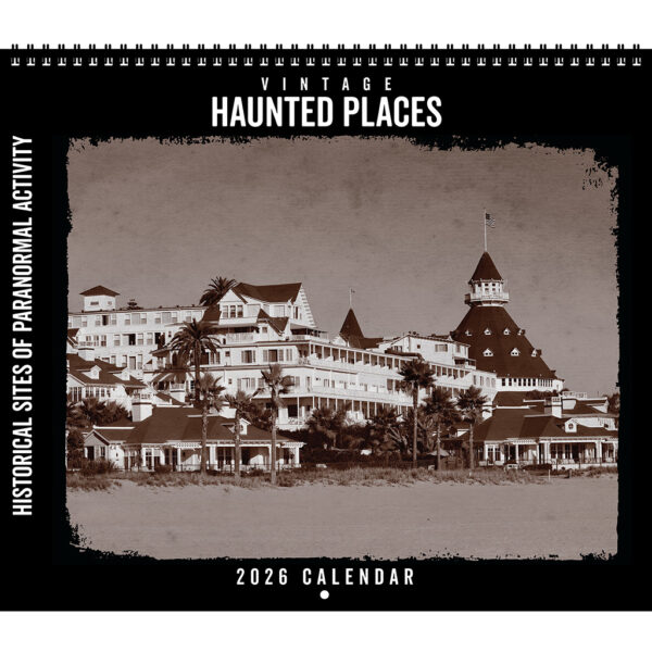
Sample image from the Asgard Press 2026 Vintage Haunted Places Calendar

Hotel del Coronado Coronado, California

Though the United States is home to many purportedly haunted hotels, The Hotel del Coronado located in California on the Coronado Peninsula is one of the most famous. Known among staff and locals as “The Del,” the Hotel del Coronado is a sprawling resort with a reputation for paranormal activity. Built in 1887 and officially opened in 1888 by entrepreneurs Elisha Babcock, Jr. and Hampton L. Story, The Del was sold in 1893 to John D. Spreckles, heir to the Bay Sugar Refining Company, who used his vast resources to develop the property into a luxury destination for celebrities, politicians, and royalty.

Though The Del is well-known for its luxury and amenities, it is perhaps even better-known for the ghostly presence of its most tragic guest, a young woman named Kate Morgan. In November of 1892 ,24-year-old Kate Morgan arrived in California and checked into the Hotel del Coronado under an assumed name. She settled into Room 3327 to either await a lover or to reunite with her estranged husband. When no one arrived for the assignation after several days, Kate despaired and took her own life on the steps leading down to the beach. Since that sad event, visitors and staff have experienced numerous mysterious and ghostly occurrences along the shore and in Room 3327, including an apparition of a woman in Victorian dress, flickering lights, sudden cold spots, disembodied voices, and objects moved out of place by an unseen hand.

Kate Morgan is reportedly not the only spirit making their presence known at The Del. The hotel’s original elevator has been known to operate on its own, stopping at random floors as if to pick up invisible guests. In some empty hallways, phantom footsteps can be heard, along with the laughter of children and the whispered voice of a woman. Shadowy figures and glowing orbs have been reported throughout the hotel, and the gift shop seems to be the favorite spot of a poltergeist that tosses objects to the ground yet keeping them unbroken.

The Hotel del Coronado is still in operation, highlighting its haunted history with regular ghost tours that are open to the public. The more intrepid visitors can even book Kate’s Room 3327 and take their chances with her sad spirit.

This will close in 0 seconds

Sample image from the Asgard Press 2026 Vintage Airplanes Calendar

The Morane-Saulnier MS.230 was a French military training aircraft developed in the 1920s by Morane-Saulnier, founded in 1911 by aeronautic engineer Raymond Saulnier (1881-1964) and Léon Morane (1885-1918), the first pilot to fly at 100 kilometers per hour (roughly 62 miles per hour), a record set in 1910. The MS.230 became France’s primary trainer in the 1930s, with nearly every World War II pilot of the French Armée de l’Air beginning their flight career within its cockpit. The MS.230 was a parasol-wing monoplane with an open cockpit, fixed landing gear, and a rugged, straightforward design. It was powered by a 230-horsepower Salmson radial engine, which provided reliable performance. The aircraft was known for its excellent handling characteristics and forgiving nature, making it ideal for training novice pilots in basic flight techniques, aerobatics, and navigation. Only the forward fuselage was clad in metal; the remainder of the aircraft’s framework, including the wings, was covered in fabric. The monoplane design of a single set of wings set this trainer apart from the more common biplanes of the era, with elevated wings attached to the aircraft by struts providing greater visibility for new pilots when learning to fly.

The Morane-Saulnier MS.230 was a well-respected training aircraft worldwide due to its ease of control and inherent stability. It was adopted by military flight training programs throughout Europe and after World War II, became a popular civilian training aircraft as well, with over 1,000 units delivered across the globe by Morane-Saulnier. There were several MS.230 variants produced through the 1930s, including a racing model and a version fitted with twin floats for takeoff and landing on water. Due to its easy maneuverability, the MS.230 was also coveted by demonstration teams and acrobatic sport pilots. Of the more than 1,000 MS.320 aircraft produced, only a handful remain today, mostly housed in museums, and none have taken to the air since 2015, two years after this monthly image
was taken.

This will close in 0 seconds

Scroll to Top